 ARTURO SALEK
Scaling a VR franchise
Redesigning the website and brand for the world's first and largest VR arcade franchise, then using targeted ads to turn visitors into bookings.
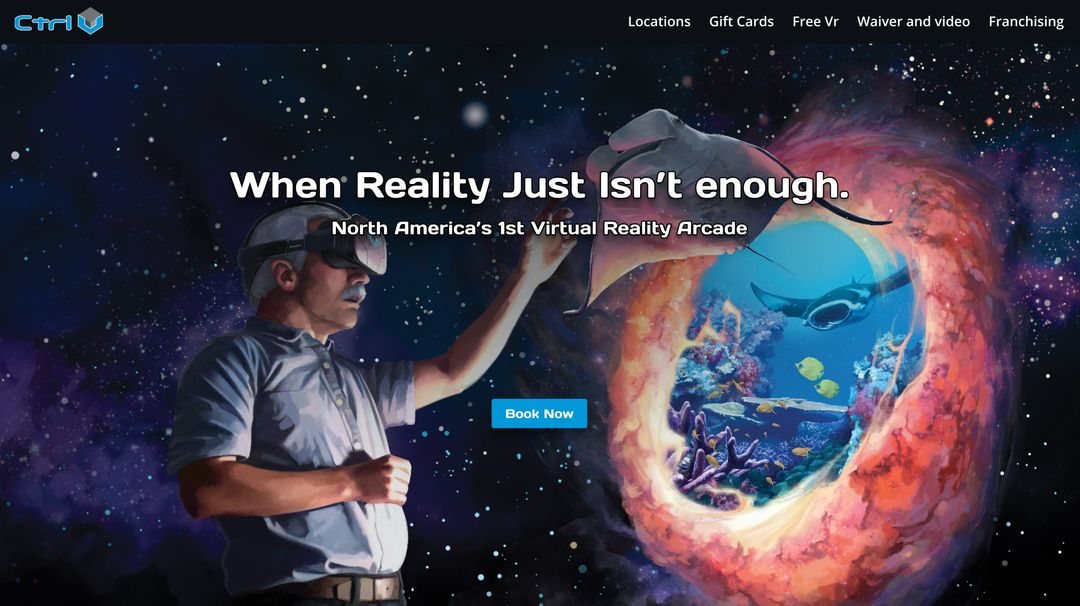
Results
Through smart customer segmentation and targeted advertising, I significantly raised revenue and lowered costs.
Project overview
I helped grow the world's first and largest VR arcade franchise. I was in charge of global, local, and corporate marketing, where I oversaw marketing for every franchisee. I led the redesign of the main website with a focus on UX, and created brand guidelines to unify the image across locations.
As part of the effort, I embedded pixel tracking into the new site, which I used to deploy segmented, targeted advertising that increased revenue across the franchise network.
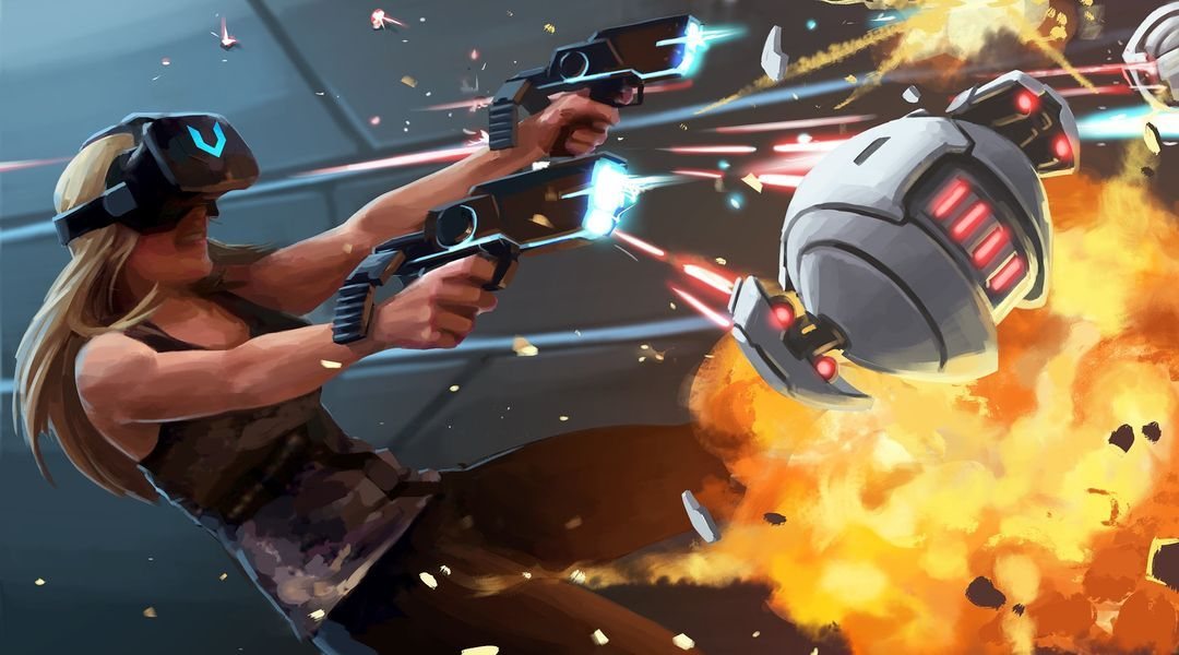
Research approach
Before designing anything, I gathered three kinds of input on what the new site needed to do.
I took apart the websites of leading VR, family entertainment, and video game companies to see what content they carried and how they displayed it.
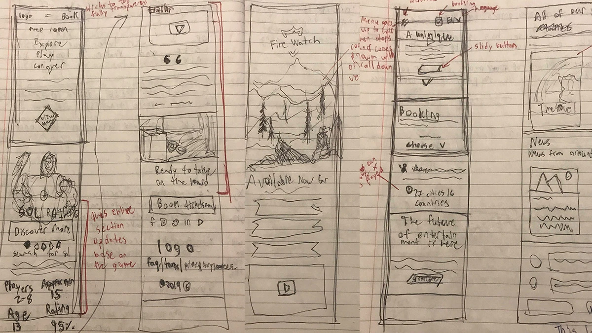
Sketched breakdowns of competitor sites, noting patterns worth borrowing, like a game section that updates based on the selected game.
CTRL V executives and franchisees ranked what they believed users valued most.
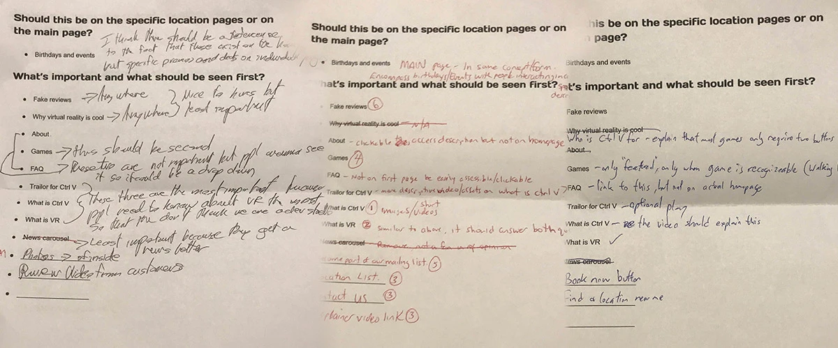
"What is Ctrl V" and "What is VR" came out on top, the news carousel was cut, and opinions split on where birthdays and events belonged.
I walked through every step a visitor takes, to find what could be improved, removed, or replaced.
Gathering user data
Three sources were layered together to paint a clearer picture of what users actually needed.
Behavior flow data tracked where visitors went after they landed.
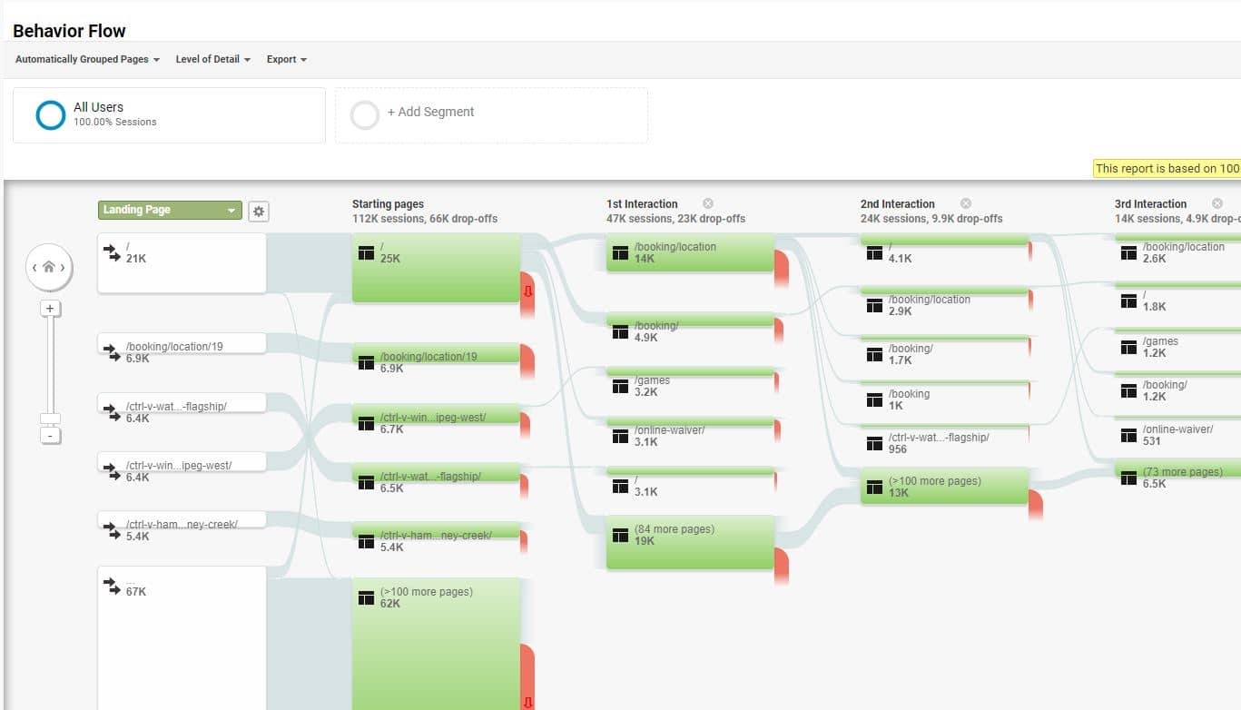
Of 112K sessions, about 66K dropped off on their first page. Most visitors who stayed went straight to booking and location pages.
Showed where people actually clicked, at scale and without interview bias.
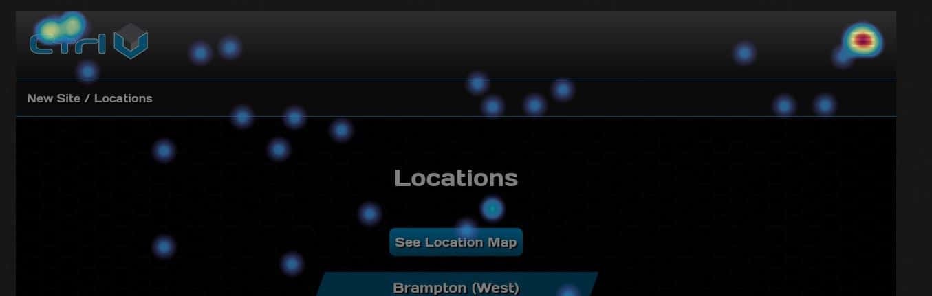
The hottest spot is the menu icon: visitors reached for navigation instead of the page content.
Captured natural behavior the other sources couldn't, like visitors lingering on text next to game art, and confirmed what the numbers suggested.
Information architecture
With the research in hand, I laid out the new site's information architecture, weighing a deep structure against a shallow one.
Deep IA
- ProFaster navigation for intent driven visits (e.g. finding an address)
- ConDoesn't make full use of game content on the landing page
Shallow IA Chosen
- ProMore keyword surface area on the homepage for search
- ProBetter for wandering users, with less navigation and more conversion
The shallow structure won, and the user data backed it up. Most visitors who made it past their first page went straight to booking and location pages, and on the locations page the menu icon drew more clicks than anything else. People were hunting for navigation, so a shallow structure put booking and locations up front, showed more to the viewer, and let the games and their content drive sales once people landed on the site.
Making events easy to find
On the old site, event photos had no labels. Visitors had to tap a photo just to find out what the event was, then tap again to reach its page. In the redesign, each event is labelled with its name right away, and tapping it opens a description, videos, and photos of what to expect.
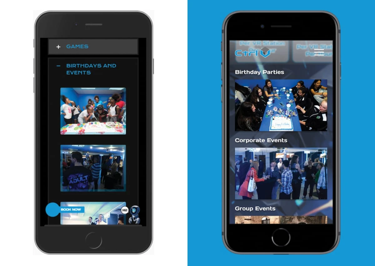
The change enabled faster consumption of information, lower bounce rates, and a more cohesive experience end to end.
Accessibility
The original site used blue text on black, which failed contrast standards. Text was changed to white.
The final design
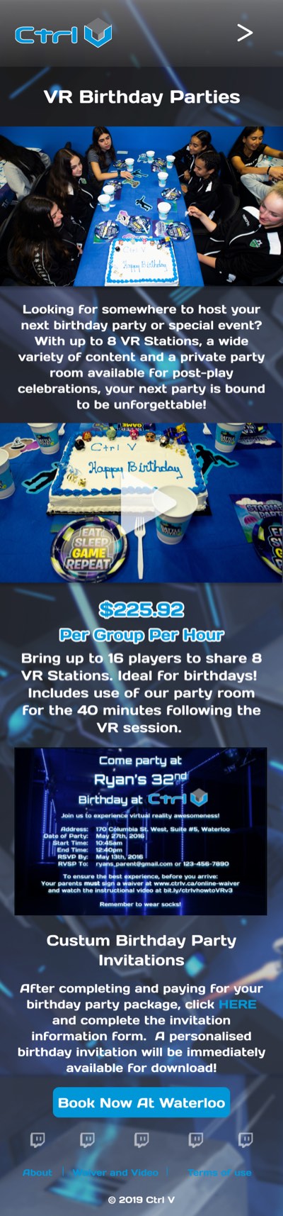
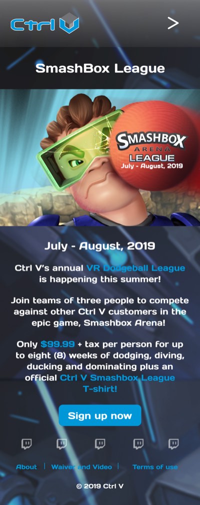
A look at the redesigned mobile site: the homepage, a franchise location page, a game page, and two event pages.



Arturo has a very unique and appealing sense of design and an impeccable eye for what really matters when it comes to his work.
He designed a website for us whose elements have stood the test of time because they achieve exactly what the visitor needs and wants.
Understanding flow, design, colours, usability, and most importantly, awesomeness, is what makes this guy and his works stand out above the rest.


Keep exploring
Organizing complexity around real work across security, manufacturing, logistics, and digital signage.
View case study →
A full platform redesign centralizing baggage, passenger, and flight data for airport operations.
View case study →