 ARTURO SALEK
Scaling a crypto exchange
Simplify, focus, streamline: rebuilding Netcoins' mobile trading experience to support rapid growth into the US market.

Results
Overview
We had just rebuilt the Netcoins mobile app on a new design system to prepare for rapid growth from our expansion into the USA. My primary focus had been on registration and supporting state compliant fund and withdrawal methods, while trade, our core product, carried over largely as it was.
Below, we take a look at how trade evolved, from before the rebuild to after it and through the redesign that followed.
Trade had served the company well to this point, but tech debt, revolving outsourcing teams, and no internal mobile engineers left it a disjointed, Frankenstein product.
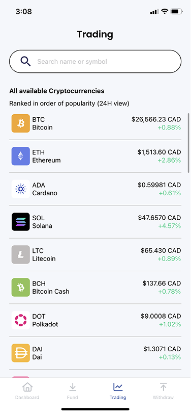
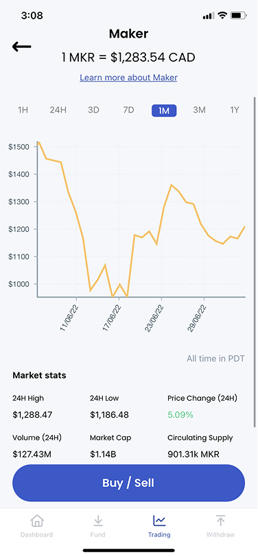
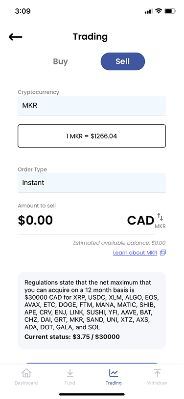
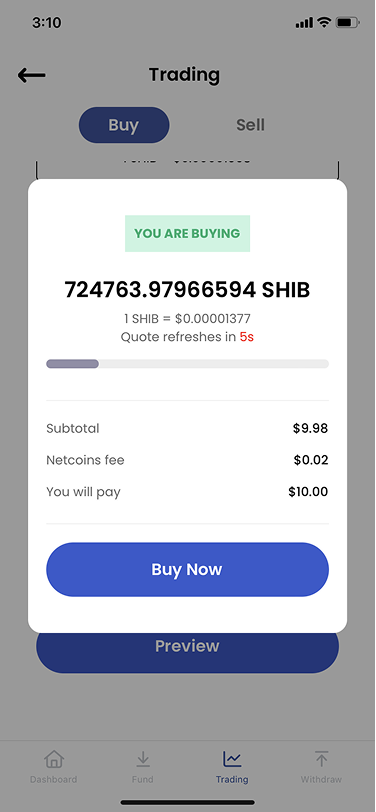
The scope was to achieve consistency and standardization. Standardized, modular building blocks made the product more cohesive and user friendly, and established the design system that paved the way for future iterations.
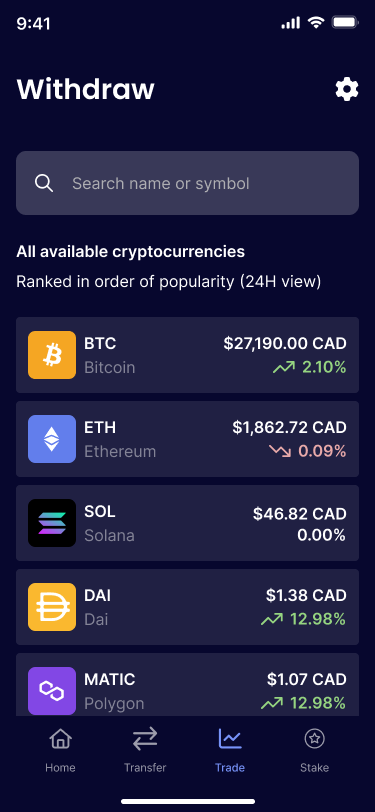
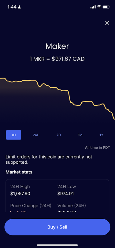
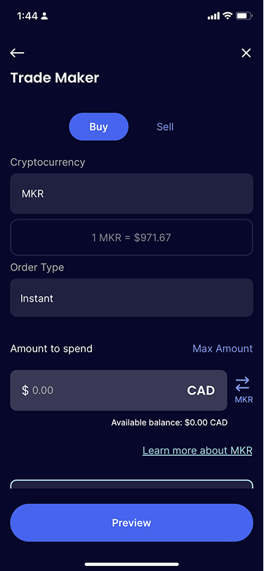
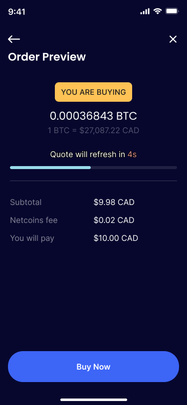
The same trade flow before and after the app rebuild.
A short timeline (a couple of months) and a single mobile developer meant changes were strategically limited to the frontend.
With our new foundation in place, it was time to overhaul our main product offering: trade. I had been pushing for this redesign since I interviewed for the role, and after aligning stakeholders and securing resources, I led it as principal designer from discovery to delivery.
UX pillars
Before touching a single screen, I defined three pillars to guide every decision in the redesign. Each change that follows traces back to at least one of them.
The user should be able to complete their tasks easily and efficiently. It should be clear what's expected of them at any point.
The user should be able to change their course of action intuitively, without being redirected.
The user should feel informed and confident about their decisions through every step of their journey.
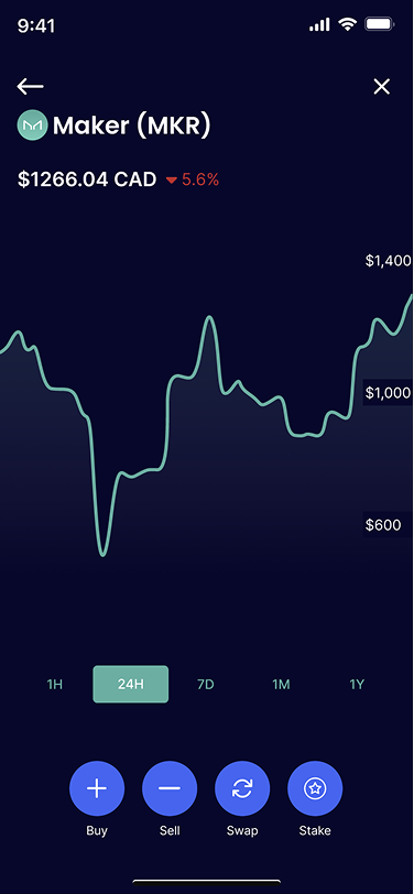
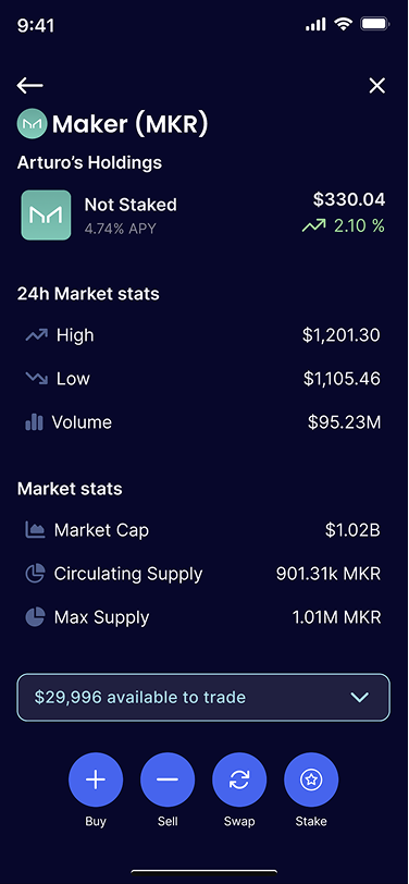
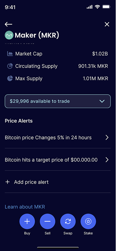
Coin details: before → after
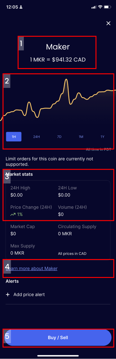
Improvements identified
- Better use of space, more relevant information
- Chart design and relevance
- Personal gains/losses per asset were missing
- "Learn more" link led to an unrelated risk statement
- Buy/sell decision point moved upstream to streamline later pages
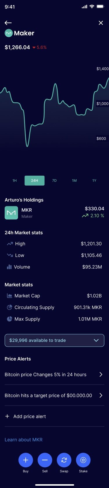
What changed
- Buy/sell action moved onto this screen
- More emphasis on the graph, made more functional
- Value axis reworked to be more useful
- Summary of asset price change over the selected period
- Better use of space overall
Coin input: before → after
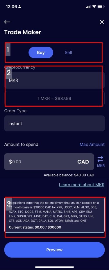
Improvements identified
- Content that could move to the previous screen
- Large amount of space for very little information
- The further down the path a user is, the more distractions should be removed
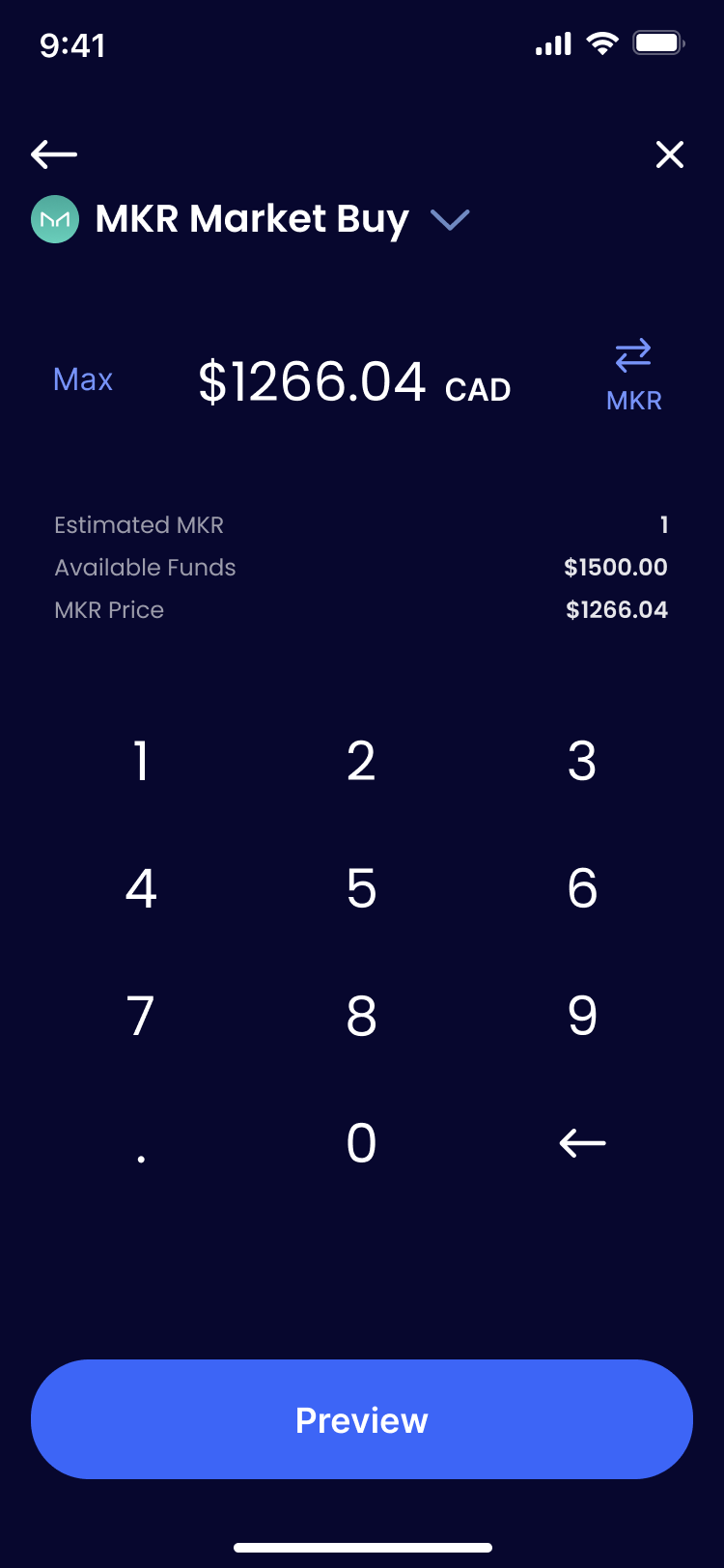
What changed
- Clearer expected action, only two relevant options (buy / sell)
- Numpad on the UI meant buy was always preselected, so no selection was required
- No misleading input fields with different properties
- Continue button always visible, no scrolling
The new Netcoins look is hot. Well done design team.

Keep exploring

End to end product design under an extremely aggressive timeline for the world's largest chip manufacturer.
View case study →
Leading the design team through Videri's shift from a B2B tool to an enterprise SaaS platform.
View case study →